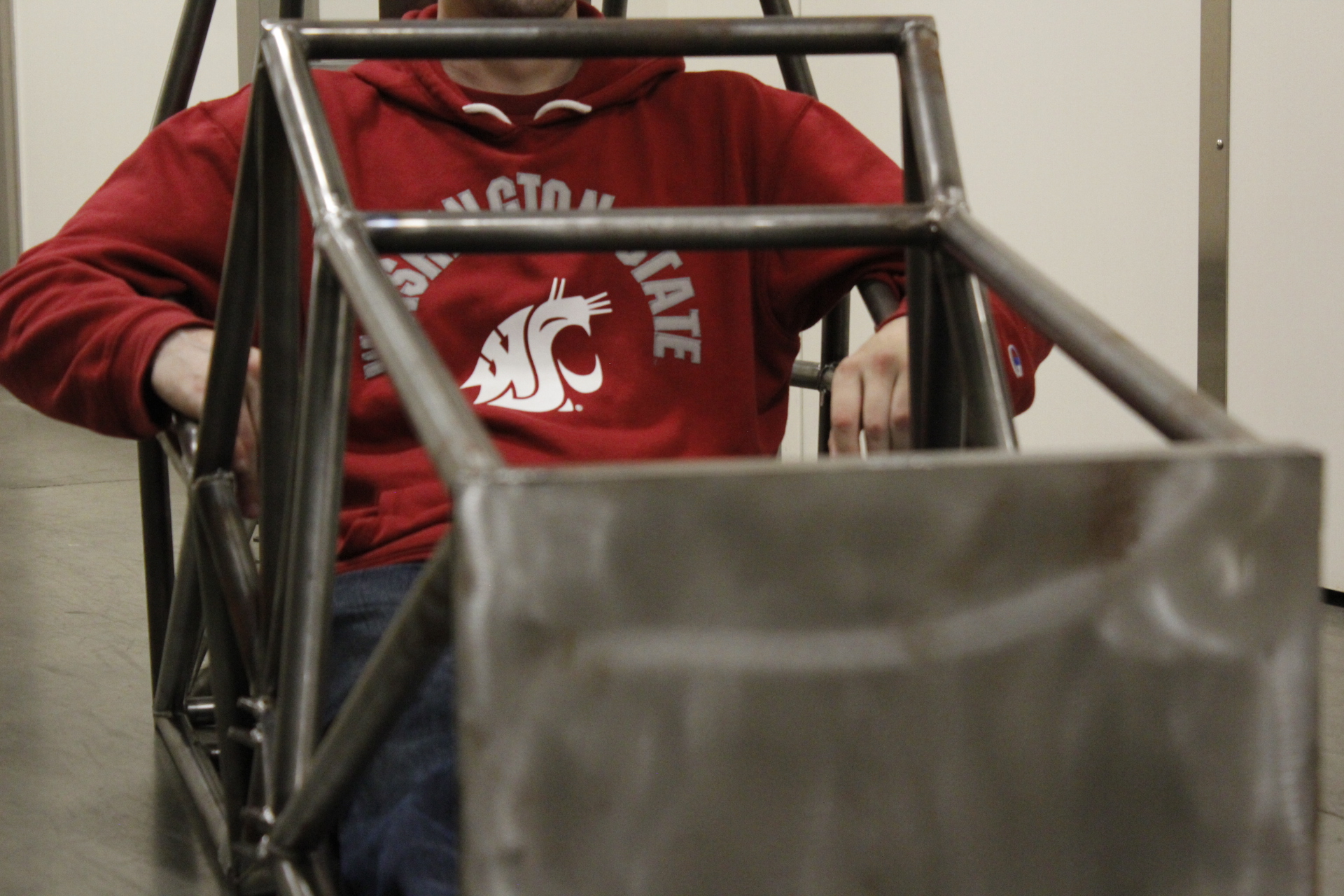
Crimson Motorsports
Objective
This project focused on rebranding a WSUV student-led motorsports club competing in collegiate Formula-style electric racing. The goal was to create a modern identity that aligned with motorsports culture while emphasizing their connection to Vancouver and the VanCougs community.
Contributions
I collaborated closely with one other designer throughout the project, contributing to concept development, naming exploration, and visual identity design. I played a key role in shaping the initial brand direction.
Rebranding

Process
We began by meeting with the club to understand how they wanted to be represented. They emphasized a strong connection to Vancouver, a modern racing aesthetic, and an engineering-driven identity. From there, we researched other collegiate motorsports teams to better understand visual trends and positioning within the space.

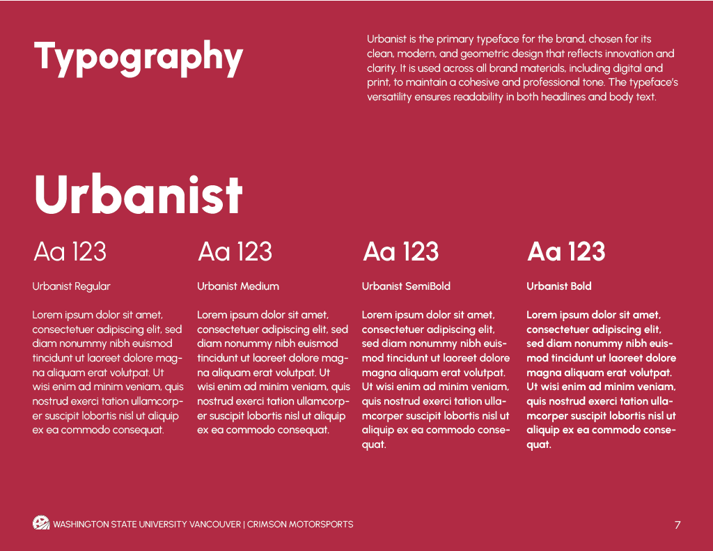
Typography
Urbanist was selected as the primary typeface for its clean, geometric, and modern qualities. It reflects innovation and clarity while remaining highly legible across both digital and print applications, supporting a cohesive and professional brand presence.
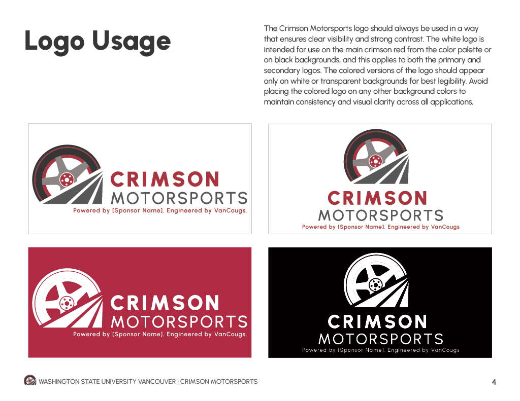
Logo
I developed the core concept for the logo using elements inspired by a racetrack and wheel to reflect motion and performance. The idea was later refined collaboratively, resulting in a mark that feels dynamic, recognizable, and aligned with the team’s identity.
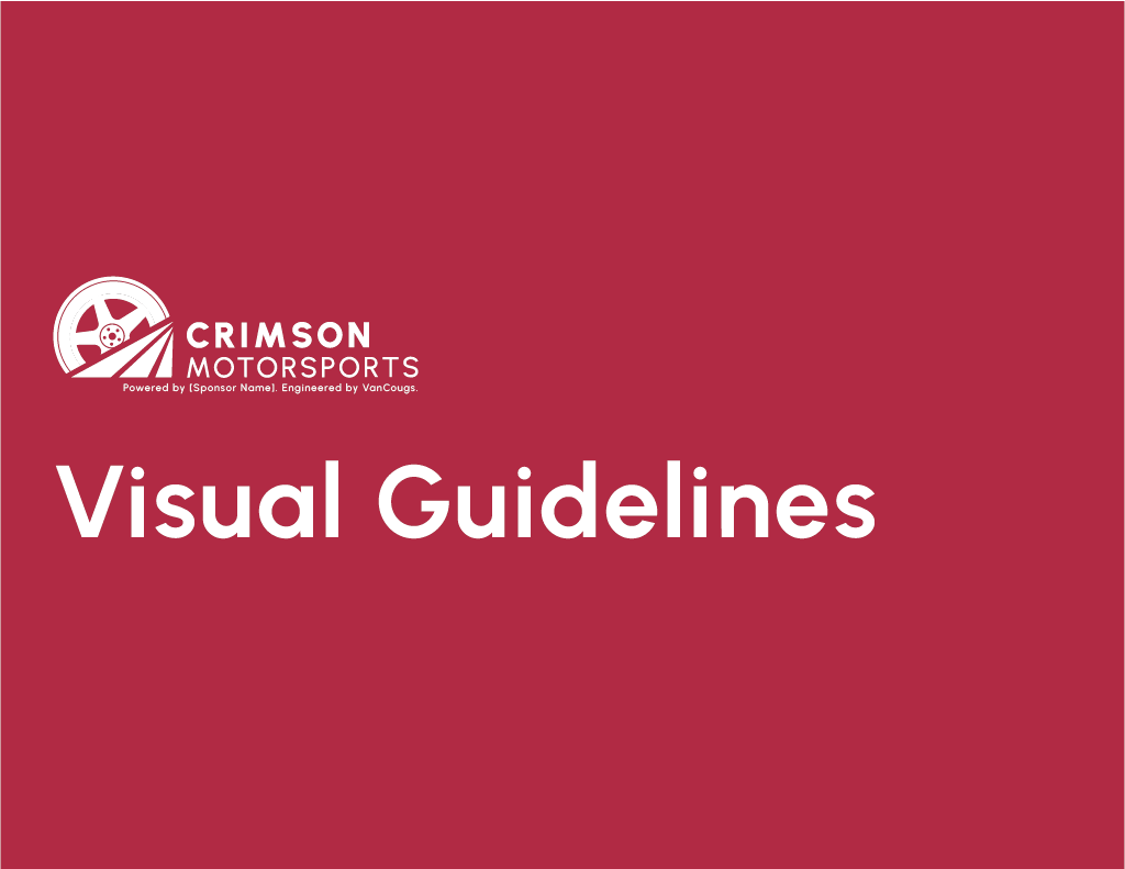
Visual Guidelines
I collaborated with another designer to develop the visual guide, where I focused on providing feedback, critiques, and design solutions to refine the system. This ensured consistency across brand elements and strengthened the overall execution.
Collaboration
This project involved close collaboration with another designer and continuous feedback from the club, which consists of multiple teams and leadership roles. We incorporated input from across the organization to ensure the final identity represented the group as a whole.
Outcomes
The final rebrand resulted in a strong, recognizable identity that was well received by the club. The logo and visual system were described as iconic and effectively captured the team’s purpose, energy, and connection to WSUV.

© 2026 Pamela Castro Jauregui. All rights reserved.